


Data in its raw form is often difficult to interpret. Data visualization is the key to unlocking data's potential. But how can we transform complex information into visual representations to make data understandable and engaging for everyone?
According to a study by Standish Group, visual information is processed by the human brain 60,000 times faster than text. This highlights the immense power of data visualization in simplifying complex datasets and facilitating quicker decision-making.
Think of it this way: imagine a report detailing website traffic over a month. With rows upon rows of numbers, it’s challenging to grasp trends or identify peak hours. But a well-crafted line graph depicting the same data immediately reveals daily traffic patterns and potential areas for optimization.
However, the power of data visualization can be a double-edged sword. Just like a poorly phrased sentence can distort meaning, bad data visualization can mislead, confuse, or even outright lie. Here’s where things get interesting – and potentially disastrous.
What is data visualization?
Data visualization is the art of transforming raw data into meaningful visual representations. By translating complex information into easily understandable formats like charts, graphs, and maps, it empowers us to quickly grasp patterns, trends, and outliers.
Often referred to as information graphics or statistical graphics, data visualization is an integral part of data science. It’s a subset of data presentation architecture, which encompasses the entire process of preparing, organizing, and delivering data in a clear and impactful manner.
Whether you have a from-scratch development idea, or already existing initiative, all we need are a couple of chats to put flesh on your project’s concept
Why purpose matters
Let’s take communication as a three-legged stool: the sender, the recipient, and the message. Each leg plays a crucial role in ensuring stability. The sender has a purpose, a reason for crafting the message. The recipient, upon receiving the message, needs to understand the purpose and respond accordingly. Here’s where data visualization shines.
A well-designed visualization acts as a bridge between the sender (who possesses the data) and the recipient (who needs to understand it). By choosing the right visual format and tailoring it to a specific purpose, data visualization services can transform raw numbers into compelling narratives.
Here’s how it achieves this:
- Explaining the complex: Consider a researcher studying global climate change. Presenting temperature fluctuations over decades as a line graph allows viewers to instantly grasp the rising trend, far more effectively than pages of statistics.
- Aiding decision making: Businesses leverage data visualization services to understand customer demographics, sales patterns, and competitor trends. These insights, presented visually, empower leaders to make informed choices about marketing strategies, product development, and resource allocation.
Data visualization is persuasive in addition to being informative. A well-designed infographic, showcasing the positive impact of a social cause, can be a powerful tool for advocacy.
However, the effectiveness of data visualization hinges on its execution. Let’s look at the example below to see how much the execution of the data visualization affects its implementation.
Bitcoin farms (places where Bitcoin is created) are combined into pools. More than 50% of all bitcoin produced is owned by just four pools, which are also located in one country – China. This centralization poses a significant risk, as a malicious takeover of these pools could potentially enable large-scale financial crimes through fraudulent Bitcoin transactions.
This idea can be illustrated with completely different infographics.
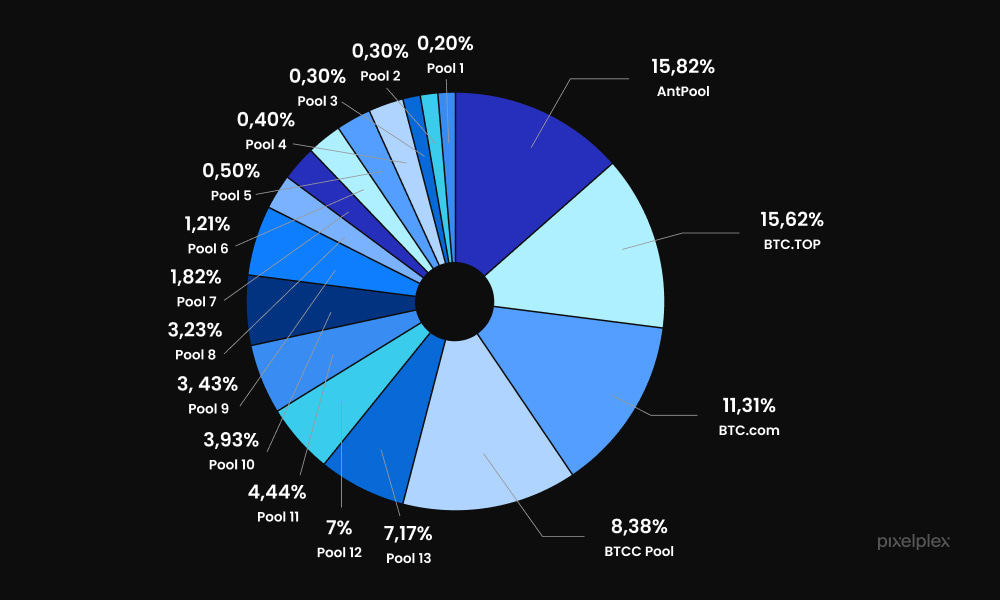
Here’s a pie chart depicting the distribution of different Bitcoin mining pools. The main problem with this chart is that it is heavily overloaded with color. The sheer number of slices, combined with minuscule text labels, makes it difficult to interpret the data and identify any trends. This is a prime example of bad data visualization.
Improved option:
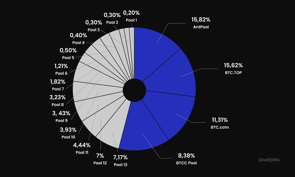
Although this chart is still a bit overloaded, in this improved form it conveys the main message much more clearly and shows the dominance of the four largest Bitcoin mining pools and emphasizes the potential risks associated with this concentrated power structure.
Check out our solution – a robust cryptocurrency trading platform with an arbitrage bot. To create a flawless user journey, our UI/UX designers put together a seamlessly navigable web control interface
Good data visualization examples (by PixelPlex team)
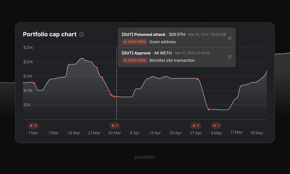
Portfolio cap graph
For this visualization, our UI/UX designers chose a simple line chart because it effectively visualizes the fluctuations of a user’s portfolio value over time. To visually emphasize scam incidents, we strategically placed red dots representing user assets directly on the line chart. Hovering over these red dots instantly reveals detailed information about each fraudulent event, providing users with a clear and interactive understanding of the impact.
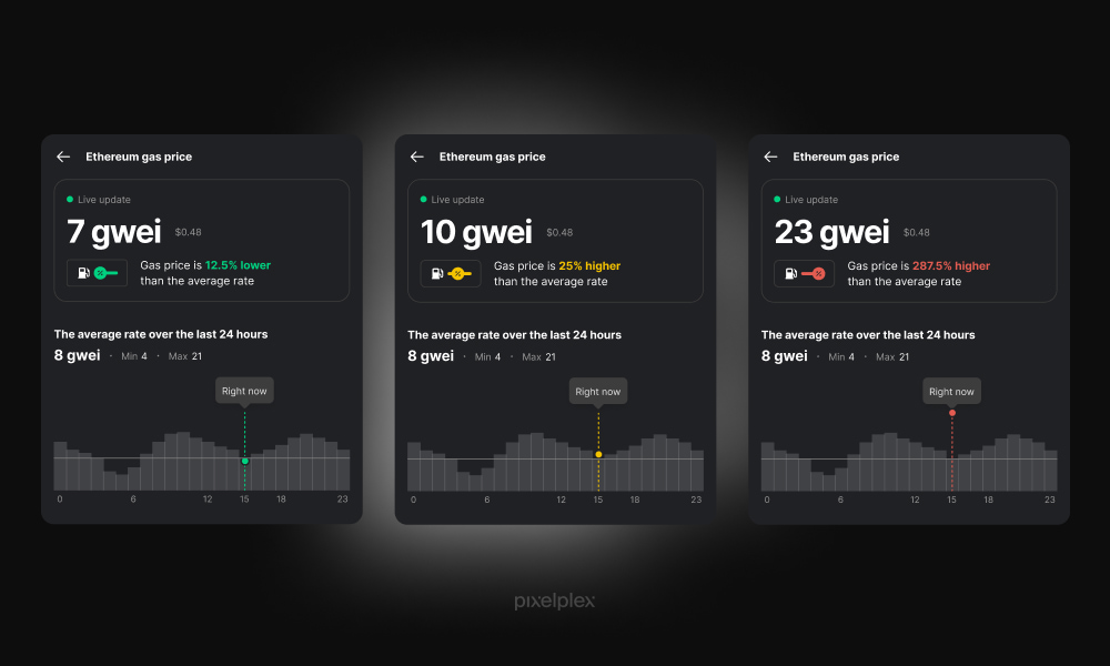
Gas cost chart
This bar chart presents a clear overview of gas costs, making it easy to compare current prices to historical averages and future predictions. We used color coding (green for normal, yellow for above average, and red for high) to instantly communicate the price level. The bar format effectively displays price variations over specific time intervals, enabling quick identification of price spikes and drops.
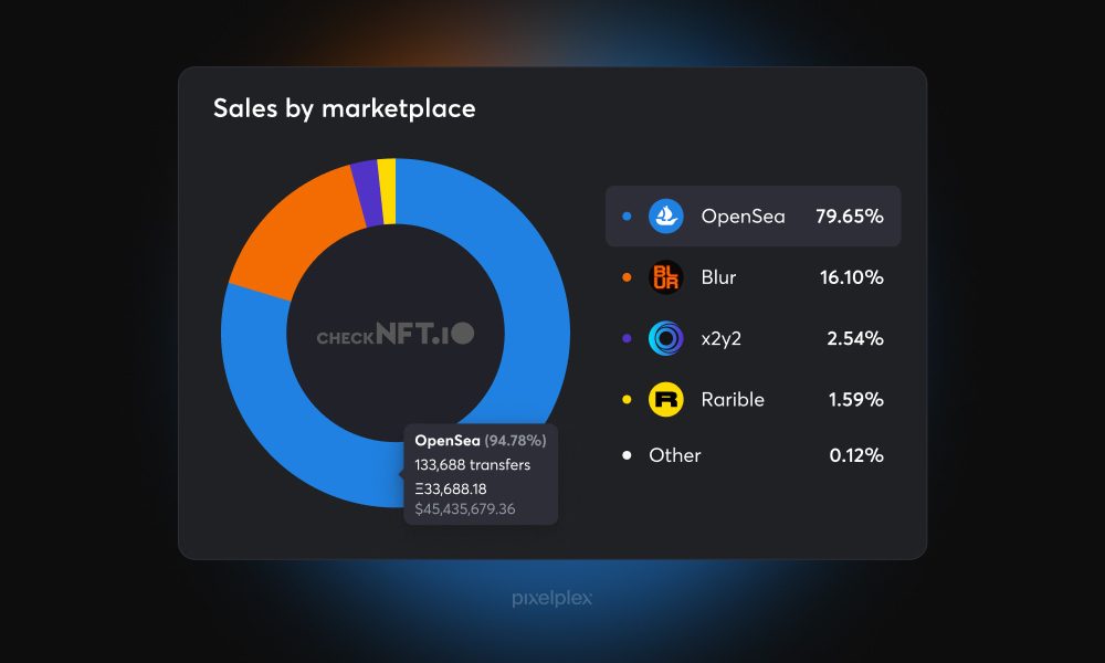
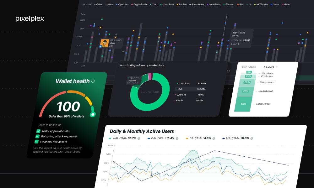
NFT market share chart
This infographic effectively uses a pie chart to visualize the market share of different NFT marketplaces. We chose this format because pie charts are particularly well-suited for representing parts of a whole, offering a simpler alternative to more complex chart types like line graphs in this context.
By breaking down the total market into proportional segments, it clearly demonstrates the relative size of each platform. Our designers implemented coding to enhance readability and understanding.
Here’s the overview of top 15 UI/UX trends in 2024 – take a look!
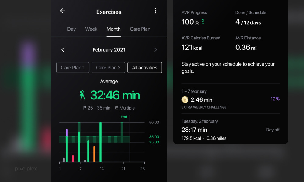
Exercise chart
Here we effectively utilized a “green corridor” visualization to simplify user understanding of their exercise levels. By establishing a clear range of optimal activity values, users can quickly determine if their daily exercise routine is sufficient. Instead of relying on a single average value, the green corridor provides a broader context, making it easier for users to visualize their progress and identify areas for improvement.
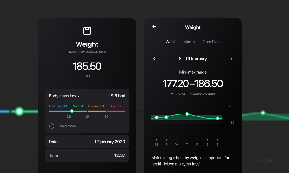
Weight graph
We employed a linear graph with a color-coded scale to illustrate weight data. This visual tool clearly shows whether a user’s weight is within the recommended range. The use of color makes it easy to quickly understand weight status, same as in the above-mentioned exercise chart. By visually representing weight goals, users can effectively monitor their progress and make necessary changes.
Bad data visualization examples
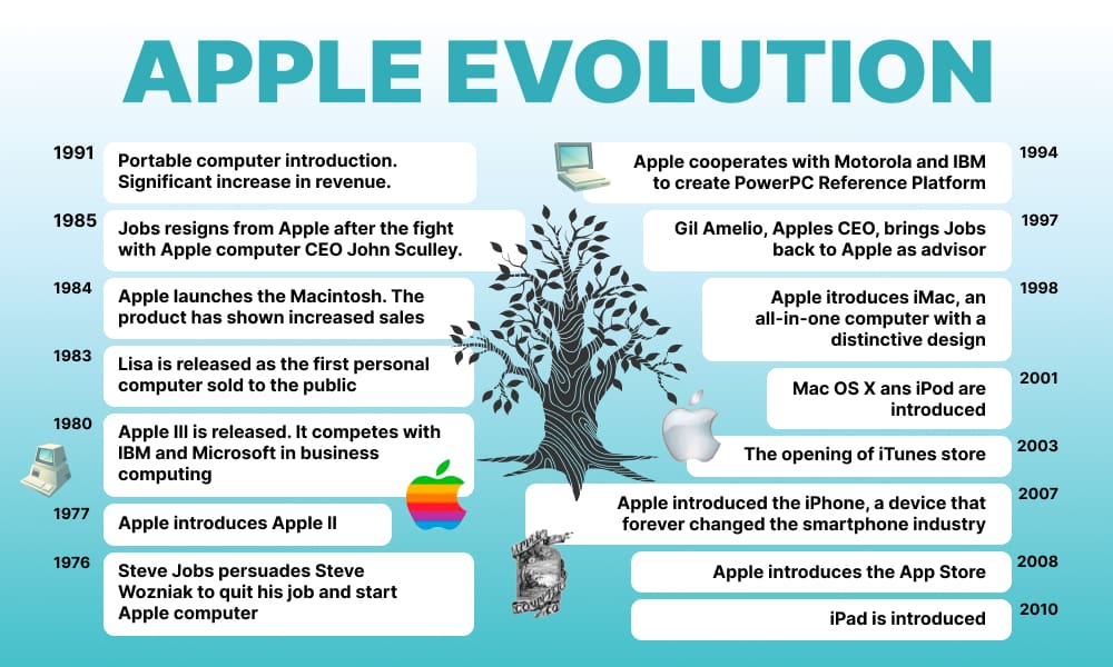
Evolution of Apple
This picture illustrates the history of Apple’s development. The infographic is overcrowded with text, making it difficult to read and understand. Small visuals and a cluttered layout hinder comprehension of the timeline. The excessive use of color is distracting, and the overall design fails to effectively convey the evolution of Apple through visual storytelling.
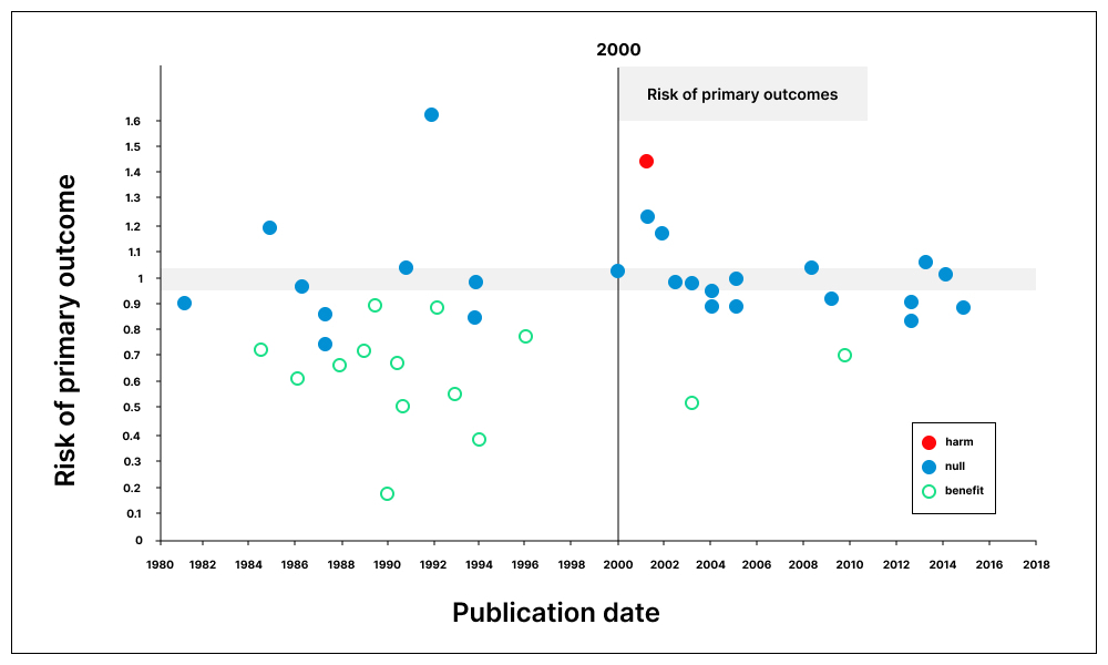
Scatter plot
This graph presents the relative risk of showing benefit or harm of treatment by year of publication. The scatter plot’s color scheme is confusing and hinders data interpretation. Initially, it is unclear which data points represent different categories, and even after recognizing the distinctions, identifying patterns is challenging. Ideally, a data visualization should be self-explanatory without requiring external context. While the graph hints at a potential regime change after 2000, its overall effectiveness is compromised by the unclear color coding.
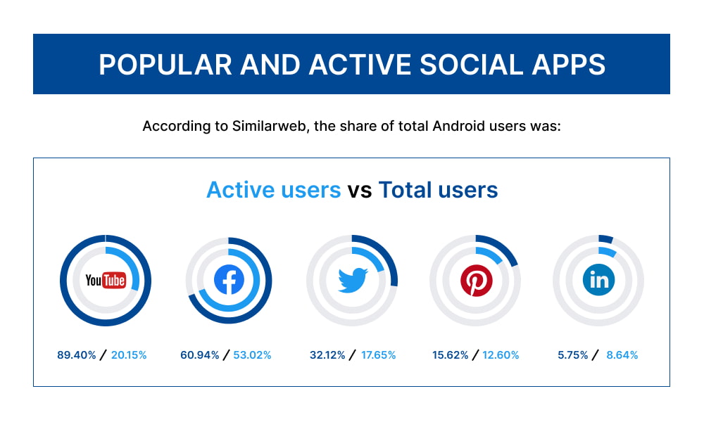
Android users chart
This infographic shows the most popular and active users of social applications on Android. The visualization fails to effectively communicate data due to its complex structure and unclear definitions, nested pie charts creates unnecessary confusion for viewers. Additionally, the meaning of key terms like “active users” and “total users” is not adequately explained, hindering data interpretation. A redesign is essential to improve clarity and understanding.
Ensure high accessibility of your solutions with our ADA-compliant web design and development
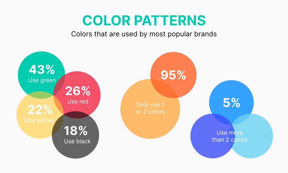
Color trends
Here’s the visualization of the world’s top brands’ most used colors. This infographic is misleading due to inconsistent bubble sizing and overlapping elements. The size of each bubble does not accurately reflect the corresponding value, making it difficult to interpret the data. Additionally, the overlapping bubbles create a visual illusion of relationships that do not exist in the data, further compromising the effectiveness of the visualization.
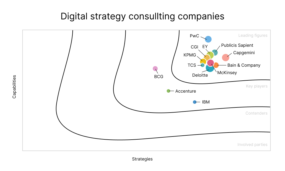
Digital strategy consulting services graph
This graph presents data on worldwide digital strategy consulting services. The axes are not labeled, leaving viewers unsure of what the “Strategies” and “Capabilities” dimensions represent. Secondly, the meaning behind the curved lines and the positioning of companies within these curves is not explained, and the use of different colored circles for companies without clear differentiation further hinders understanding.
Data visualization tips and best practices
The goal of data visualization is to effectively communicate insights. To achieve this, clarity and simplicity are paramount. By choosing appropriate chart types and adhering to strong design principles, you can create visualizations that are both informative and engaging.
Clarity is key
A well-designed visualization tells a clear story. Use simple charts like bar graphs and line graphs to highlight key points. Ensure the visual hierarchy is clear by using color, size, and annotations strategically. Contextual information, such as titles and labels, is essential for understanding the data.
Choosing the right chart type
The type of chart you select depends on the story you want to tell. Dot charts and bar charts are generally more accurate for representing quantitative data than other chart types. The length of a bar and its position relative to a baseline are easier to interpret than angles, colors, or 3D shapes. While pie charts, color variations, and 3D visuals can be used effectively, their precision for comparing numerical values is limited.
Ultimately, the best chart depends on the specific data and the message you want to convey. If accuracy in comparing values is crucial, bar and dot charts are the preferred options.
Accuracy is essential
Trustworthiness is crucial for data visualizations. Always verify the accuracy of your source data. Transparency is key, so include clear labels and axis definitions. Continuously evaluate your visualization to ensure it accurately represents the data.
Know your audience
Consider your audience’s knowledge level when designing your visualization, and tailor the complexity and level of detail accordingly. Clearly define your goals for the visualization to guide your design choices.
Add interactive elements
Interactive charts and graphs can be dynamically updated based on user input, fostering deeper engagement and understanding of complex data patterns. For instance, filtering options allow users to focus on specific data subsets, while zooming and panning provide granular control over the visual representation.
Best Ways to Visualize Data with Power BI
Our UI/UX designers have recently helped to personalize online shopping for a multi-platform eCommerce system – the result was really impressive!
Conclusion
We’ve put together some great and not-so-great data visualization examples to help you create amazing visuals. Now you can see what works and what doesn’t.
To make the best data visualizations, you need an expert team that can handle complex data and make it clear and engaging. It’s like building a house – you need a strong foundation. That’s where we come in! From IT consulting services to the development of stunning visuals, we can help you tackle any business challenge.
We know data visualization can be tricky, but don’t worry! Check out some of our designs for inspiration.
Ready to create data visualizations that wow your audience? Book a call with our team! Project consultation is free of charge.


