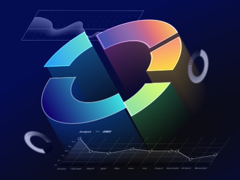
Struggling with lagging dashboards? You can get rid of this inefficiency by developing an efficient data model and harnessing real-time data visualizations.
Graphics, charts, and other visuals are easier for people to understand than lengthy documents filled with text, numbers, and statistics. What really sets real-time data visualization is promptness in decision-making.
A C-level executive won’t change their company’s strategy based on just one chart. But what about individuals who need to make quick, on-the-spot decisions? Real-time data visualization consulting services can become a game-changer, offering insights on the fly.
In this article, we’ll explore the most significant use cases for real-time data visualization and offer tips and best practices for its effective implementation.
What is real-time data visualization?
Real-time data visualization presents data through visuals as it is generated and processed. This enables immediate data analytics and helps users understand what’s happening in the moment. It’s like a live feed for your data, showing you what’s happening as it happens.
By turning streams of incoming data into visuals, real-time data visualizations let you catch trends, spikes, and anomalies in the moment. This instant snapshot helps you make quick decisions, keeping you agile and informed.
Retail Business Intelligence: 6 Main Benefits and 12 Key Use Cases Explained
What are the benefits of real-time data visualization?
Real-time data visualization offers several key benefits, including:
- Enhanced decision-making. It enables quicker, data-driven decisions by providing up-to-the-minute information, reducing response times to emerging situations.
- Streamlined data analysis. Leveraging real-time data visualization you can save time and resources by eliminating the need for manual data compilation and review.
- Improved performance monitoring. Real-time data visualization facilitates continuous monitoring of operational processes, systems, and performance metrics, providing for immediate adjustments.
- Proactive problem-solving. Instant data visualization helps in identifying issues in real-time, allowing for prompt intervention before problems escalate.
- Better customer experience. Interactive dashboards and visuals support real-time tracking of customer behavior and trends, enabling personalized responses and services.
Interested in data visualization? Check out our article, which provides clear strategies for effective storytelling through data visualization
8 use cases of real-time data visualization across industries
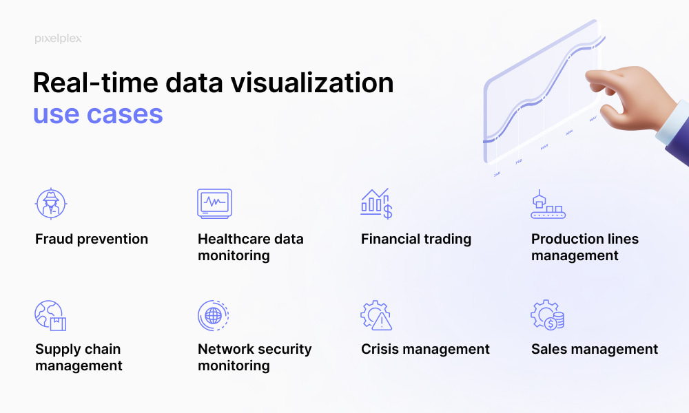
Real-time data visualization excels in numerous scenarios across various industries, offering critical insights and enabling swift decision-making where it matters most.
1. Fraud prevention
In sectors like banking and e-commerce, where security is paramount, having a system that visualizes data in real time can help minimize fraudulent activities and reduce risks.
Using real-time dashboards, security teams can promptly detect unusual transaction patterns or attempts to breach security protocols. This not only helps minimize security threats but also significantly reduces the risk of financial losses and protects customer trust.
2. Healthcare data monitoring
Real-time data visualization in healthcare tracks critical patient metrics like heart rate, blood pressure, oxygen levels, and even glucose levels. This technology allows medical staff to quickly detect and react to urgent health situations.
For instance, monitoring real-time data can help in identifying sudden changes in a patient’s condition, such as irregular heartbeats or drops in oxygen saturation, enabling prompt intervention.
3. Financial trading
In financial trading, real-time data visualization offers instant updates on stock prices, currency exchange rates, and other financial metrics. This allows traders to make quick, informed decisions and seize market opportunities as they arise.
4. Production lines management
Real-time data visualization services assist in manufacturing, facilitating the monitoring of production lines and ensuring prompt identification of quality issues. This empowers manufacturers to enhance product quality while minimizing downtime.
For instance, real-time data visualization can detect anomalies in production metrics like machine performance, temperature fluctuations, or material usage, allowing immediate adjustments to maintain efficiency.
5. Supply chain management
Real-time data visualizations also shine in supply chain management. For supply chain managers, having a live dashboard means you can track your shipments across the globe in real time. You can see if a shipment is delayed, in transit, or has arrived, making it easier to manage expectations, plan for contingencies, and ensure everything runs smoothly.
Consequently, supply chains can swiftly optimize routes, reduce fuel consumption, and improve operational efficiency.
6. Network security monitoring
Real-time dashboards play a crucial role in monitoring network security, particularly for IT leaders overseeing tech enterprises. With this technology, you gain complete visibility into your network’s health, quickly detecting potential security breaches or vulnerabilities as they unfold. This helps you implement proactive measures to safeguard your company’s data integrity.
7. Crisis management
The use of real-time data visualization technology can be especially useful in crisis situations. During a crisis, such as a cybersecurity breach or supply chain disruption, real-time visualizations enable organizations to monitor unfolding events in real-time, facilitating rapid decision-making and response.
For example, in the case of a cyberattack, real-time visualizations can help IT teams quickly identify the source of the breach, assess its impact on systems and data, and implement immediate remediation measures to mitigate further damage.
Similarly, during a supply chain disruption, real-time visualizations allow businesses to track inventory levels, transportation routes, and delivery schedules, allowing for proactive adjustments to minimize disruptions.
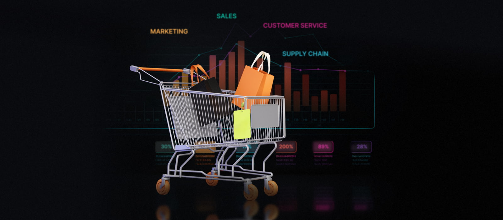
8. Sales management
With interactive dashboards, sales teams can receive immediate insights into key metrics, including customer behavior, revenue, and conversion rates. They can track in real time the progress of sales campaigns, monitor the effectiveness of promotional strategies, and adjust tactics on the fly to optimize results.
Moreover, real-time data visualizations can deliver valuable insights into customer preferences, allowing sales teams to deliver targeted sales pitches and offers. For instance, they can offer customers personalized recommendations based on their current shopping context, like a grocery store suggesting recipes using items in their cart.
On top of that, real-time dashboards provide sales departments with improved inventory management by allowing for promptly restocking popular items. This grants businesses increased flexibility, enabling them to deliver more products to consumers efficiently.
How to enable real-time data visualization step by step
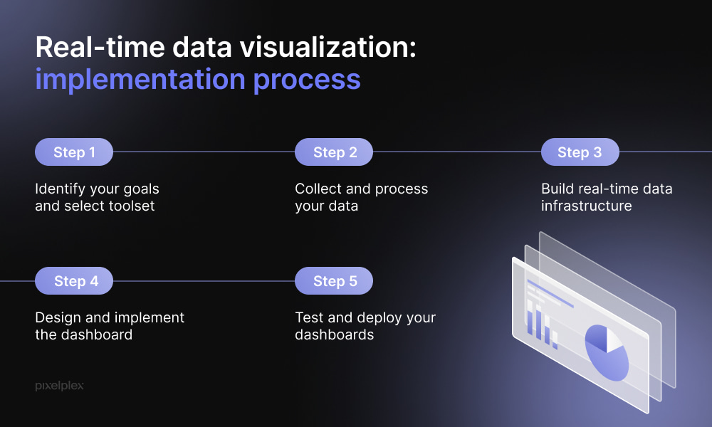
Building a real-time data visualization dashboard requires careful planning, a clear understanding of objectives, and the right tools. By following the steps below, you can create a dashboard that offers valuable insights to your audience in real time.
Step 1. Identify your goals and select toolset
Determine what you want to track. This could include sales, website traffic, performance metrics, etc. Knowing this information, you can move to selecting the tools that align with your objectives.
There are many efficient tools for data visualization to choose from. Some of the good options include Tableau, Power BI, and Zoho Analytics.
For a detailed comparison of the best 10 data visualization tools, we strongly recommend reading this article
Step 2. Collect and process your data
You need to collect and aggregate the data you wish to visualize and monitor. It’s crucial to ensure that the data is accurate and well-structured. This may require you to perform data cleansing, normalization, and transformation, among other tasks.
Step 3. Build real-time data infrastructure
Consider implementing data streaming technologies such as Apache Kafka and AWS Kinesis to handle real-time data feeds. At this step, you should also select a suitable database optimized for real-time data. Some options to consider are InfluxDB, Apache Druid, and Firebase.
Step 4. Design and implement the dashboard
Plan how to organize the dashboard and choose the appropriate visualizations (e.g., charts, graphs, and maps) for your data, ensuring they are clear and understandable. Then, create the charts and graphs based on your design.
After that you can integrate your visualizations into the dashboard platform. You should also make sure data feeds are correctly connected for real-time updates.
Check out some of the best practices for visualizing data efficiently with Power BI
Step 5. Test and deploy your dashboards
Test the dashboard thoroughly to guarantee it updates in real-time and displays data correctly. Once that’s done, you can deploy your dashboard setting it up on a server or cloud platform. And, obviously, do not neglect regular updates and checks of the dashboard and data pipelines for issues.
Real-time data visualization best practices
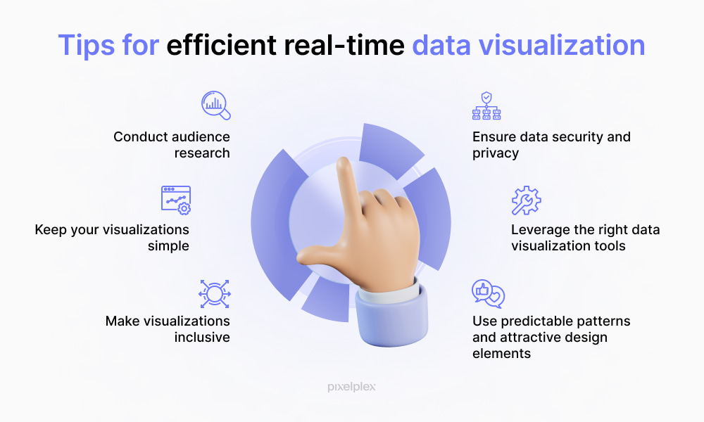
Below are some essential practices to consider when incorporating real-time data visualization into your workflows.
Conduct audience research
Gather information about your audience through surveys, interviews, or analysis of existing data. This will allow you to determine what questions your audience needs answered and what they aim to achieve with the information provided by your visualizations. This will guide the selection of data and the design of your visualizations.
Ensure data security and privacy
When visualizing real-time data, you should remember that it might involve sensitive information that may be subject to privacy regulations. Therefore, you need to implement strong security measures to protect sensitive data. This could include access controls, encryption, and regular security audits.
Keep your visualizations simple
Make sure you keep your data visualizations clean. This approach focuses on minimizing clutter and complexity to ensure that the data presented is easily understandable at a glance. This could be done through:
- Limiting color usage
- Using white space around and between elements
- Focusing on displaying only the most relevant data
- Implementing consistent design elements
Leverage the right real-time data visualization tools
Although it may sound cliché, the choice of a data visualization tool that aligns with your criteria will significantly impact the effectiveness of your data visualizations. When making your choice, pay attention to the following factors:
- Compatibility with existing data sources
- Scalability
- User experience
- Customization and flexibility
Make visualizations inclusive
You need to make sure that your visualizations are accessible and understandable to a wide and diverse audience. Follow accepted web accessibility standards, such as Web Content Accessibility Guidelines (WCAG) to make your visualizations more accessible to people with disabilities.
This includes providing text alternatives for non-text content, ensuring sufficient contrast between text and background, and making all functionality available from a keyboard.
For expert guidance, consider utilizing web accessibility consulting to ensure your visualizations meet these standards effectively.
Reach out to the PixelPlex team for accessible web development and design
Use predictable patterns and attractive design elements
Adopting a predictable pattern for layouts and incorporating attractive design elements will allow for facilitating user experience and streamlining data comprehension. Make sure to apply a consistent visual hierarchy across all your visualizations to guide the viewer’s eye through the data in a logical sequence.
It would be also wise to develop templates that adhere to your layout and design standards. This will not only speed up the creation process but also provide consistency across all your visualizations.
Data visualization with PixelPlex
By providing instant insights into current trends and performance metrics, real-time data visualization empowers businesses to make informed decisions swiftly.
At PixelPlex, we clearly understand the importance of effective data visualization, helping our clients translate complex data into compelling visual stories. We offer:
- Data visualization consulting
- Data visualization design
- Data visualization implementation
- Big data consulting
- Support and maintenance
- Power BI and Tableau consulting
- Data science development services
Reach out to our data visualization team for more information. With 17 years of technical expertise and over 450 completed projects to our credit, we’re equipped to tackle any technology challenge.