Navigating through extensive data sets often presents a complex challenge where extracting valuable insights can become a daunting task. Data visualization tools adeptly address this issue, enabling organizations to easily interpret and analyze their business insights.
Data visualization transforms complex data into understandable visuals, simplifying the interpretation and aiding in making informed business decisions. It reveals actionable insights and provides a clear path to recognize patterns, trends, and opportunities that might have been overlooked. This enables teams to strategize effectively based on the visualized information.
There are numerous data visualization tools available on the market, each with its own strengths and weaknesses.
In this article, we will compare ten of the best data visualization tools for 2026, providing an overview of their unique features, advantages, and disadvantages to help you choose a tool that best fits your business’s needs and enhances your data analysis capabilities.
Talk to our R&D technology consultants and discuss cutting-edge tech strategies that will help your business stay ahead in the digital era
What are data visualization tools and why are they important?
Data visualization tools are software applications that convert vast and complex data sets into visual, often interactive, formats such as graphs, charts, and maps, making the data more accessible and understandable. These tools enable organizations and individuals to interpret the data, identify patterns, trends, and insights, and essentially, turn data into actionable information.
The importance of data visualization tools is underscored by the increasing volume and complexity of data that businesses and organizations handle daily. In an era where data is crucial to decision-making, these tools facilitate a more straightforward interpretation of information, enabling professionals to identify which areas require improvement or investment, predict sales volumes, and understand performance metrics, among other things.
What are the key characteristics of best data visualization tools?
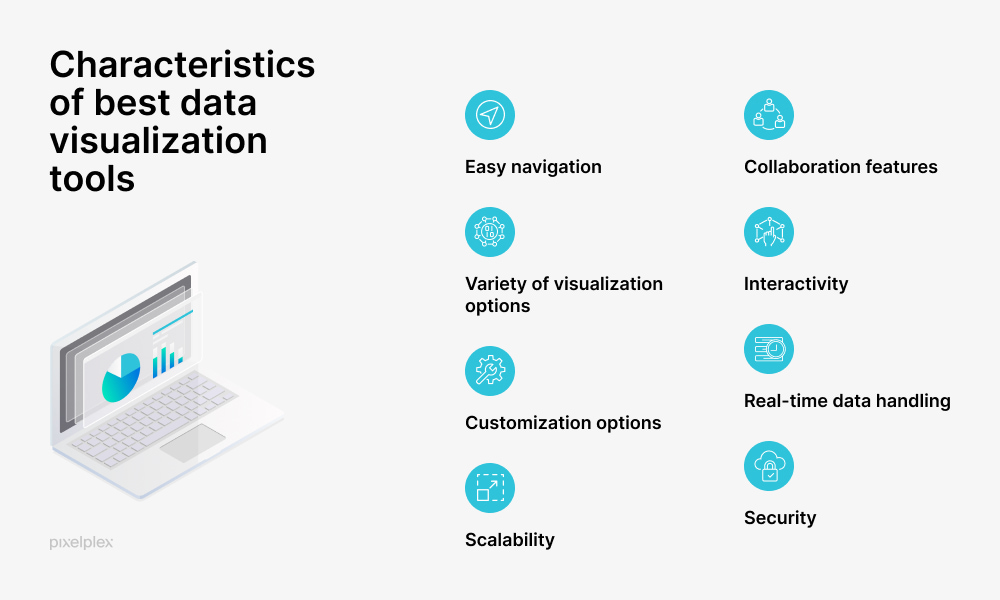
Although various data visualization tools have their own set of unique characteristics, there are certain features that all robust data visualization software should have in common. Typically, these are:
Easy navigation. Data visualization software tools should be constructed in user-friendly ways with easy navigation and comprehensive documentation. Otherwise, users may find themselves entangled in a complex web of functionalities, potentially leading to decreased efficiency and frustration.
Collaboration features. Users should be able to share, comment, and collaborate on visualizations to derive actionable insights.
Variety of visualization options. A robust data visualization tool should allow users to choose from various visualization formats, such as bars, charts, graphs, and heat maps, to cater to different data types and visualization needs.
Interactivity. Rather than observing static visuals, users should be able to engage with the visual data actively, for example, by zooming, drilling down, filtering data, and making dynamic adjustments.
Customization options. Tailoring visualizations to users’ specific needs helps enhance clarity, comprehension, and impact of the data being presented. Users should be able to adjust colors, sizes, and formats in line with their specific presentation needs.
Real-time data handling. An efficient data visualization tool should be able to process, analyze, and visualize data as it is created, received, or updated. This feature is crucial in various sectors and scenarios where timely data interpretation can influence decision-making, optimize processes, or even prevent potential issues.
Scalability. Data visualization software should be able to handle increasing amounts of data and users as an organization grows.
Security. This aspect is crucial not only for safeguarding sensitive and proprietary data but also for ensuring compliance with various data protection and regulation policies and requirements.
Explore the most recent data analytics trends and insights
Comparison of 10 best data visualization tools
Below is the list of best data visualization tools compiled by our data analysts. The list was created taking into account different factors, such as the popularity of the tool among users, ease of navigation, a variety of provided visualization options, and customization opportunities.
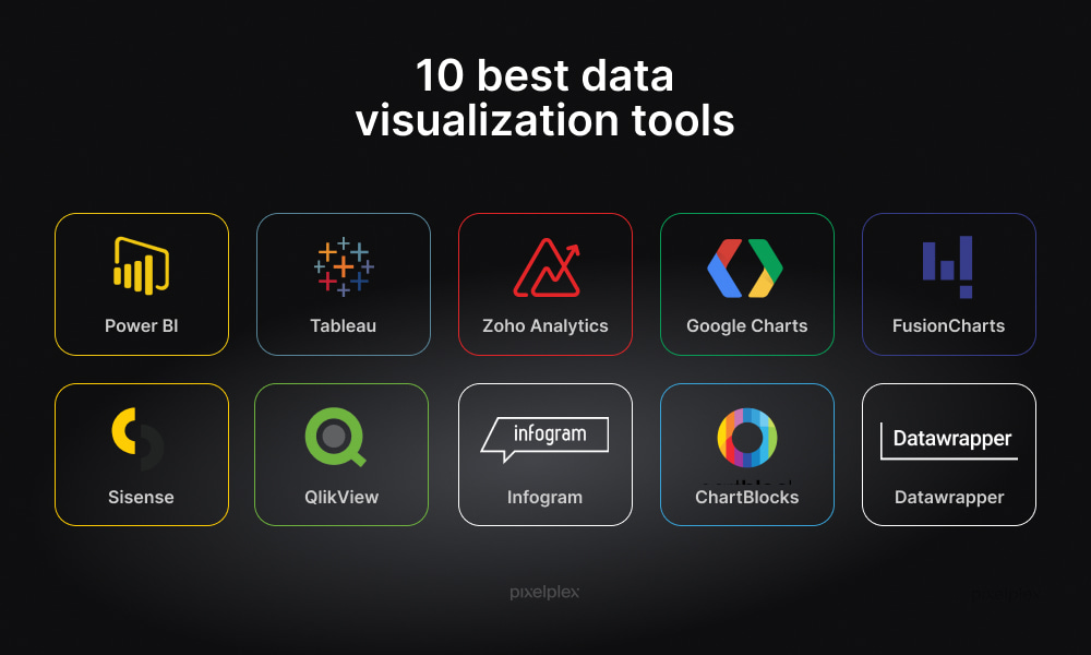
1. Power BI
Power BI by Microsoft is considered to be one of the most powerful data visualization tools that converts data from various sources into interactive bi-dimensional and three-dimensional visualizations and reports.
The visualization tool supports a wide array of backend databases such as Teradata, Salesforce, PostgreSQL, Oracle, Google Analytics, Github, Adobe Analytics, and Excel, providing stunning visualizations and real-time insights to facilitate swift decision-making at the enterprise level.
Key features
- Embedded business intelligence. A company that provides comprehensive business intelligence consulting, can help enhance capabilities, enabling organizations to visualize their data, share insights, and embed them in an app or website.
- Customization functionality. Allows users to create custom visuals and interactions based on their data analysis needs.
- Data connectivity. Offers extensive data connectivity options, connecting to various data sources, from Excel spreadsheets to cloud-based and on-premises data.
- Collaboration options. Enables sharing of reports and dashboards, facilitating collaborative decision-making.
- Integrated artificial intelligence. Utilizes AI to provide automated insights and analytics.
Pros
- Seamless integration with Microsoft products and other external platforms
- Ease of use and an intuitive interface suitable for users with varied expertise
- A wide array of visualization options, including charts, graphs, and maps
- Mobile accessibility
- No speed or memory constraints
- Embedded business intelligence
- Free version with limited functionality available
Cons
- Advanced features might have a steep learning curve for new users
- Depending on the dataset size and study complexity, it may exhibit longer data processing and report generation times compared to other analytics and data visualization tools

Storytelling With Data Visualization: Insights for Impactful Business Strategies

How to Create Effective Data Governance Strategy: A Step-By-Step Guide
2. Tableau
Tableau is one of the most widely used tools for data visualization and business intelligence, enabling users from technical and non-technical backgrounds alike to craft customized dashboards and visualizations.
Tableau offers integrations with advanced databases, including MySQL, SAP, Teradata, Hadoop, and Amazon AWS. Additionally, it provides a free version of the product, ensuring that anyone can create visualizations suitable for various settings.
Key features
- Interactive dashboards. Allows users to create visualizations with the ability to drill down content, visually isolate subsets of the data, change the order in which the data is displayed, and many more.
- Data blending. Provides the ability to blend different relational, semi-structured, and raw data sources in one view.
- Collaboration functionality. Allows for the sharing of analysis and visualizations in a secure manner.
- Real-time data analysis. Capable of interpreting and analyzing data in real-time.
Pros
- Support for multiple data sources, including databases, spreadsheets, and web data connectors
- User-friendly interface and ease of navigation
- Free public version available
- Mobile responsiveness
- Developed community
Cons
- Resource-intensive, requiring a good hardware setup, especially for larger datasets
- In public versions, you cannot keep data analysis private
- Can be expensive for small businesses or individual users
Check out the main differences between Power BI and Tableau to understand how each tool can cater to your specific data visualization and business intelligence needs
3. Zoho Analytics
Zoho Analytics is a comprehensive business intelligence, online reporting, and data visualization tool that allows you to create appealing data visualizations and insightful dashboards in minutes.
Zoho Analytics offers a cloud-based solution that can handle large datasets and provides a variety of reporting options, making it a versatile tool for businesses of all sizes.
Key features
- Ease of data integration. Supports data integration from over 250+ datasources, being able to connect data from files, web URLs, databases, feeds, business apps, and more.
- A self-service data preparation and management app. Helps to get you business data cleansed, transformed, and enriched to ensure better analysis.
- Supported augmented analytics. Allows for augmenting your analysis with AI, ML, and NLP to gain quick insights from your data.
- Data blending. Automatically blends data from hundreds of apps, offering end-to-end insights across your business.
- Automated reporting. Empowers users to schedule and automate the delivery of reports via email
Pros
- A plethora of visualization options, including interactive charts, widgets, and tabular views
- Intuitive drag-and-drop interface
- Collaborative and pre-built analytics
- Mobile responsiveness
- Embedded BI
- Free version with limited functionality available
Cons
- Some users find its functionality complex and non-intuitive
- The tools has a 2000-record limit in a report export
- Some features might require time to learn and utilize effectively
4. Google Charts
Google Charts is a powerful data visualization tool designed for creating graphical charts from user-supplied information. The user provides data and a formatting specification via JavaScript embedded in a web page and the service delivers an image of the chart.
Known for its simplicity and integration with Google products, this tool allows developers and data analysts to create dynamic, live visualizations that can be easily shared and understood, making data more accessible and actionable for decision-makers and the general audience alike.
Key features
- Interactivity. Provides interactive and dynamic dashboards and data visualizations
- Customization. Offers extensive options to customize visuals and data representations.
- Web embedding. Enables embedding of interactive charts and data visualizations into web pages.
- Dynamic data collection. Allows real-time data updates and interactions.
Pros
- A wide variety of chart types, including line, bar, pie, scatter, and many more
- Seamless integration with Google products
- Cross-browser compatibility
- User-friendly interface and straightforward chart creation
- A free platform for creating various data visualizations
Cons
- Limited advanced customization options
- Privacy concerns due to the fact that data is processed online
- Limited support compared to other tools on the market

How to Boost Profits and Increase Client Loyalty with Customer Data Analytics: Complete Guide

A Detailed Guide to Data Discovery Processes, Tools, and Best Practices

8 Best Applications of Data Science in Finance
5. FusionCharts
FusionCharts is one of the most adopted data visualization tools that allows developers and data analysts to create interactive dashboards and reports across web and mobile platforms.
The tool has rich data visualization capabilities and offers over 100 chart types and 2,000 maps. FusionCharts is also known for its ease of integration with various development platforms and its ability to work seamlessly with both JSON and XML data formats.
Key features
- Interactivity. Provides interactive features like tooltips, clickable legend keys, and drill-down.
- Seamless export and share functionality. Empowers users to export entire dashboards as PDFs and send live copies of dashboards to their emails, while also enabling sharing them across platforms.
- Live data streaming. Supports real-time data streaming and automatic updates for charts.
- Customization. Offers extensive customization options for visuals and interactions.
Pros
- A wide array of charting options to suit various data visualization needs
- Active community
- Extensive documentation and demos to assist developers
- Seamless work across both mobile and web platforms
Cons
- May be a complex tool for beginners
- Expensive compared to many other data visualization tools
- Complex setup
Want to enhance your data visualization solution with predictive analytics? Talk to our team
6. Sisense
Sisence is one of the most agile and easy-to-use data visualization tools that allows users to consolidate, analyze, and visualize information seamlessly, thereby facilitating data-driven decision-making.
Recognized for its robustness and scalability, Sisense allows users to manage and integrate data from various sources, create interactive dashboards, and derive actionable insights, catering to both technical and non-technical users.
Key features
- Drag-and-drop interface. Provides an easy-to-use interface for creating different types of charts, graphs, and other visualizations.
- End-to-end data management. Offers comprehensive data management from integration to visualization.
- Embedded analytics. Enables embedding of analytics and dashboards into other applications.
- AI-powered insights. Incorporates artificial intelligence to derive insights and automate processes.
- Customizable dashboards. Allows users to customize interactive dashboards in line with their data visualization needs.
- Scalability. Scales easily to accommodate growing data volumes and user needs.
Pros
- An easy to understand interface that caters to both technical and non-technical users
- High scalability and customizability
- Integrated data management
- Robust integration capabilities with various data sources
- Advanced AI and ML features for comprehensive data analytics and insight generation
Cons
- May require substantial system resources for optimal functionality
- Can be on the higher side for small and medium businesses
- It can be challenging to create and maintain analytical cubes (high-performance analytics databases with fast data stores)
Our ML engineers can equip your data analytics solution with advanced ML algorithms that will enable informed decision-making
7. QlikView
QlikView is a powerful yet easy-to-use data visualization tool that enables users to create and manage interactive reports, dashboards, and other types of data visualizations. The tool allows data visualization from multiple sources and promotes in-depth analytics, thus facilitating a user-friendly experience for creating robust and insightful data visualizations.
Key features
- Associated data modeling. Allows data visualization from multiple sources, thus enhancing detailed analytics.
- Interactive dashboards. Enables the creation of dynamic, interactive data visualizations.
- Self-service capabilities. Helps users in generating their reports and analytics without IT assistance.
- Data compression. Compresses data to 10% of its original size for swift in-memory analysis.
- Collaborative functionality. Allows users to share insights and data visualizations.
- Advanced reporting. Provides advanced reporting and embedded analytics features.
Pros
- Swift data processing and visualization capabilities
- Detailed, multi-source data analytics
- Flexible data visualization tool allowing for the creation of varied reports and visualizations
Cons
- May require some time and training to fully utilize its data visualization capabilities
- Might be perceived as expensive for small and medium-sized enterprises.
8. Infogram
Infogram is a user-friendly web-based tool that allows users to quickly and easily create engaging infographics, charts, and reports. This data visualization tool ensures seamless integration with multiple media apps, including YouTube, Google Drive, Giphy, Vimeo, and Iframe. It also allows for import of data from Excel, Dropbox, JSON, Google Analytics, and more.
Infogram offers a free version, making it accessible to a wide audience for creating compelling visualizations in various contexts.
Key features
- Real-time collaboration. Allows your team members to visualize data in real time while making it possible to organize your team into groups and setting role-based permissions.
- Interactivity. Provides interactive charts, maps, reports, and dashboards that are always up-to-date.
- Drag-and-drop functionality. Has an intuitive drag-and-drop editor that enables users to easily edit colors and styles, add icons, and set display options.
Pros
- Tiered pricing structure, which includes a complimentary plan offering basic functionality
- Drag-and-drop editor
- Provides API for importing additional data sources
- Has over one million high-quality, royalty-free stock photos, GIFs, icons, and flags
Cons
- Limited customization in free version
- May not be suitable for complex visualizations
- Possesses limitations for advanced customization options

How Does Data Science Help Define NFT Value?

How Document Management Systems Help Businesses Efficiently Manage Workflows
9. ChartBlocks
ChartBlocks is a data visualization tool that emphasizes simplicity and ease of use, enabling users to seamlessly create data visualizations, choose from hundreds of customization options, and embed charts into any website.
The software’s website claims that all a user needs to do is collect their data, and ChartBlocks will visualize it. It can build a chart from databases, spreadsheets, and other types of data directly.
Key features
- Chart building wizard. Allows for simplified creation of charts, without coding skills.
- Embedding and sharing. Enables users to embed charts on websites or share them on social media
- Various chart types: Supports a variety of chart types to cater to different visualization needs.
- Customization. Offers basic customization options to tailor charts in line with users’ needs.
Pros
- Drag-and-drop functionality
- Reasonably priced plans with free plan available
- Quick chart creation and sharing
Cons
- Does not offer extensive customization options for more detailed visualizations
- Can display a maximum of 10,000 rows of data when plotting larger datasets
10. Datawrapper
Datawrapper stands out as a user-friendly data visualization tool, enabling journalists, developers, and designers to create simple, effective charts, maps, and tables without requiring extensive coding knowledge. This tool is particularly favored in online content creation sectors due to its straightforward interface and the ability to create embeddable visualizations swiftly.
Key features
- Embeddable visuals. Empowers users to embed visualizations directly into websites and online platforms.
- Customization. Provides opportunities for customizing the appearance of visualizations.
- Annotation. Allows users to add notes and highlights to their visualizations.
Pros
- Easy navigation, making it an ideal tool for beginners
- Its free plan is a good fit for smaller companies
- A variety of visualization options, including charts, maps, and tables
- Ensures that visualizations are readable and interactive on all device types
Cons
- Limited data sources
- Has less advanced features compared to other data visualization tools
- May not be suitable for building complex charts or handling large data sets
Implement data visualization with PixelPlex
Navigate through the complexity of your data effortlessly with PixelPlex’s cutting-edge data visualization services. Our team can consult you on choosing the best data visualization tool that aligns with your business needs while assisting with its implementation and customization.
Contact our team to drive informed decision-making, unveil hidden trends, and elevate your data visualization strategy.